- Get link
- X
- Other Apps
- Get link
- X
- Other Apps
Better notification management and a nice visual overhaul.
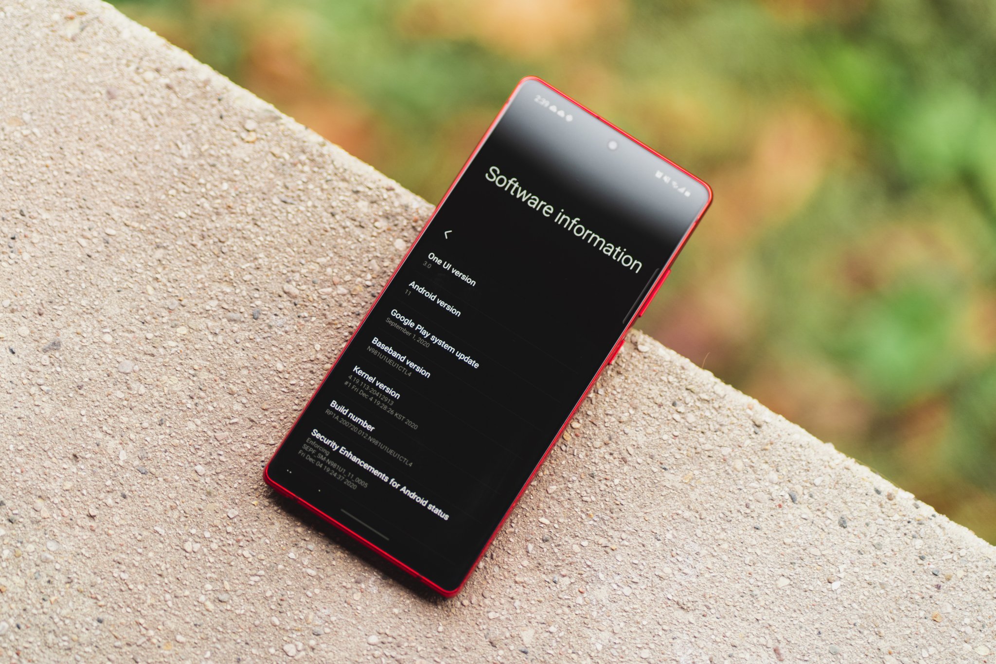
2020 has been full of surprises, and that apparently includes Android 11 making its way to some of the best Samsung phones about a month ahead of schedule. While Android 11 is mostly Google's doing, this update also features Samsung's new One UI 3.0 software overlay, which introduces new aesthetics and improved first-party apps.
While we didn't expect the update to roll out to the Galaxy Note 20 line until some time in late January, my unlocked Note 20 has had it for a few days now, giving me the chance to go hands-on and explore all of the new changes. If you have a Galaxy S20, S20+, or S20 Ultra, the update should already be available to you, as well, and owners of other Samsung devices can expect to see it in the coming months.
Powerfully affordable
Samung Galaxy Note 20
$800 at Amazon $800 at Best Buy $800 at B&H
The Note, commoditized
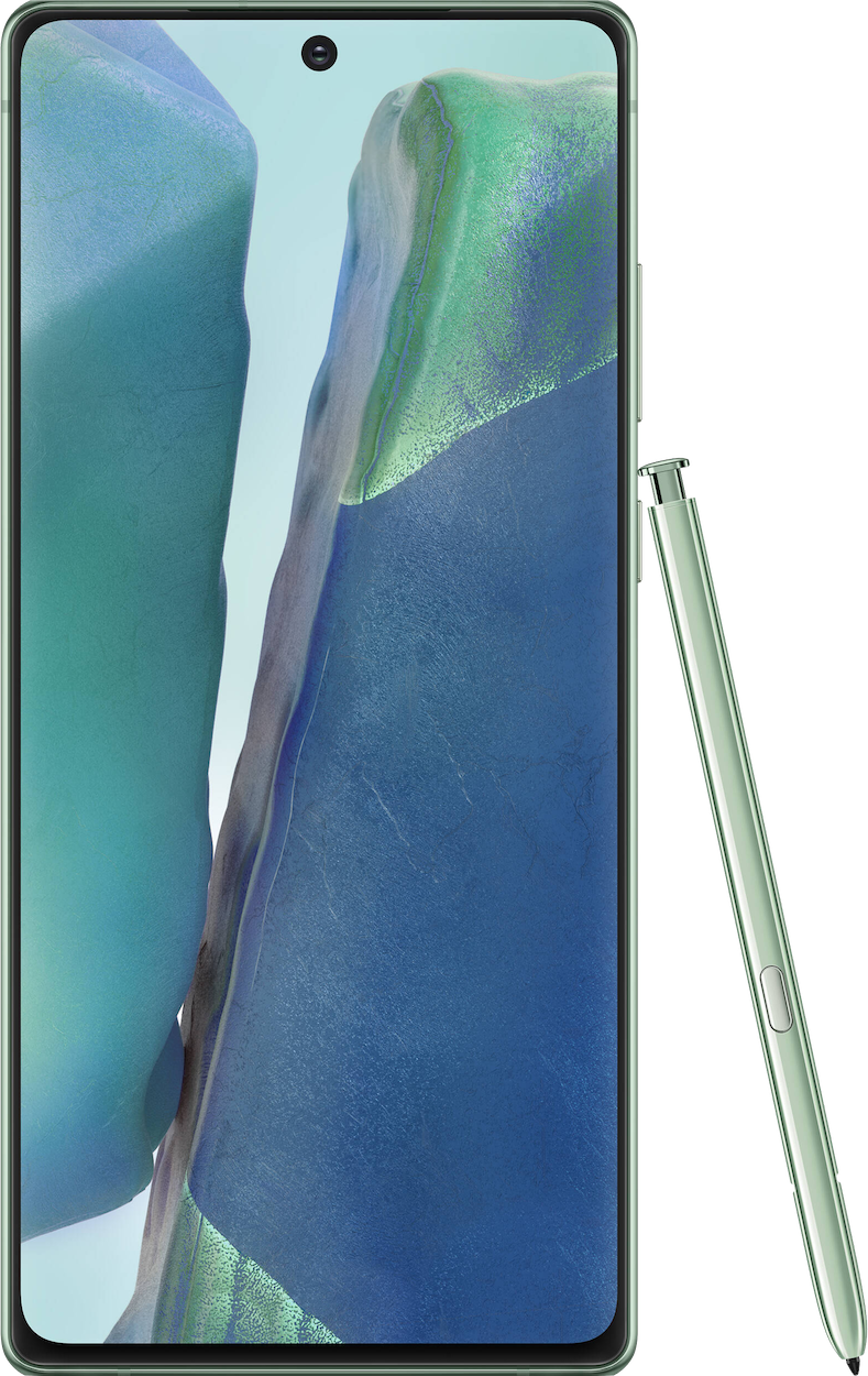
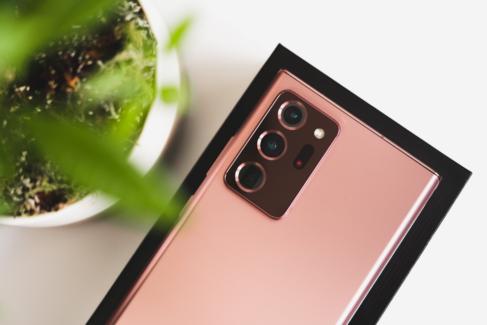
The Galaxy Note 20 received Android 11 ahead of schedule, and it runs spectacularly on the device's powerful Snapdragon 865+ chipset. It features a 6.7-inch AMOLED display with S Pen support and flat edges, and the back is a resilient plastic that's both water-resistant and supports wireless charging.
One UI 3.0 Adding Android 11's core features
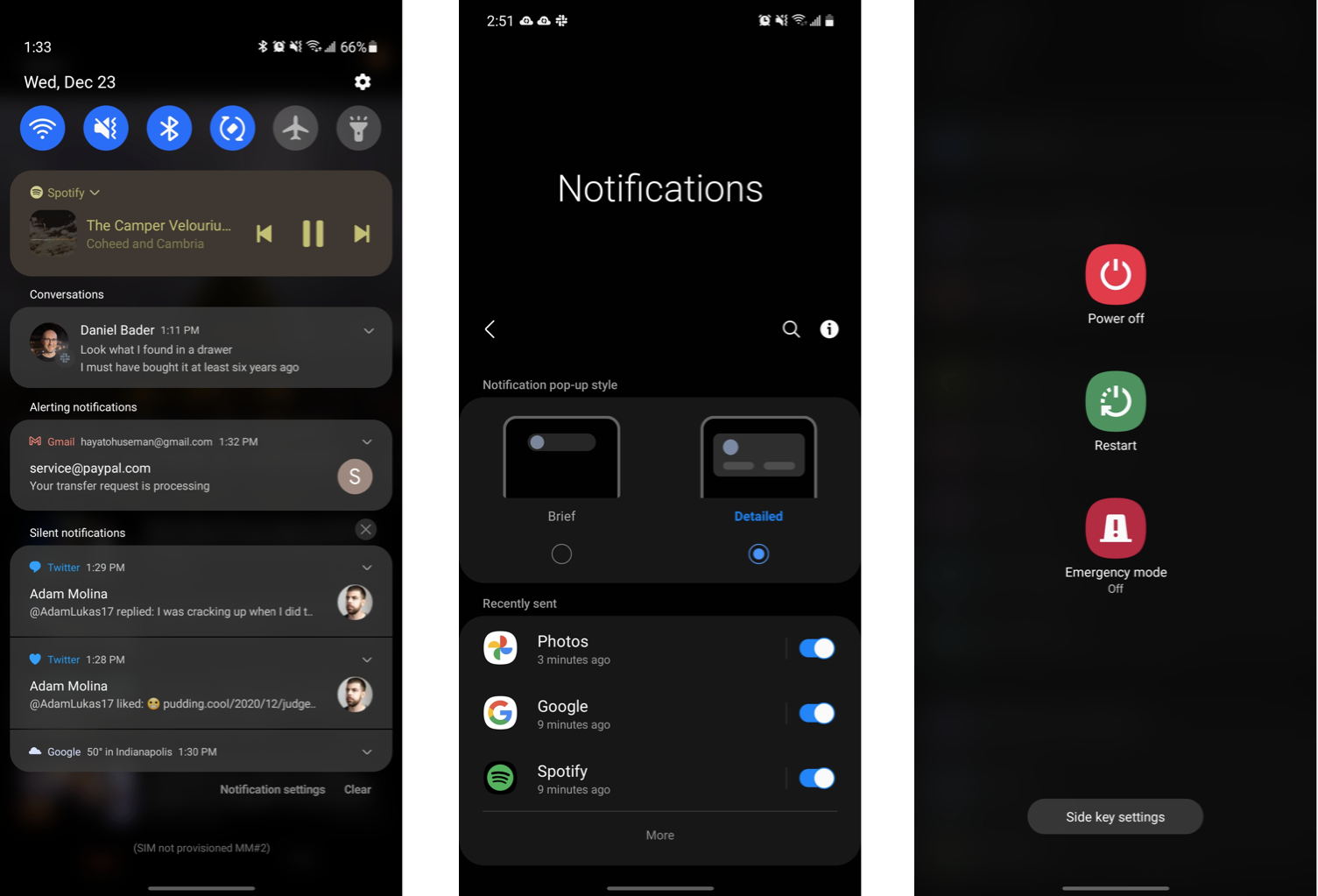
When it first rolled out to devices like the Pixel 5, Android 11 had a clear focus on improving notification management, and though the look of One UI is drastically different from that of "stock" or "pure" Android 11, the same core tenets are all here. One UI 3.0 now groups notifications by category, broken down into conversations, alerting notifications, and silent notifications.
Just like on other Android 11-powered devices, this categorization makes it subtly easier to prioritize notifications; if something pops up in the conversations tab — say, a Telegram or Slack message, it doesn't get lost in the mix of incoming emails, news and weather updates, and the like.
If you want to go a step further and really bring conversational notifications to the forefront of your attention, One UI 3.0 supports Bubbles, those love-it-or-hate-it floating app icons directly inspired by Facebook's old Chat Heads system. I'm personally not a big fan of Android 11's Bubbles, but they're a bit easier than jumping back and forth between your messaging app and whatever other task you're in the middle of.
Samsung brought over nearly every Android 11 feature, but I really would've loved a better power menu.
Continuing on the topic of notifications, there's a new Gaussian blur effect behind the notification shade that provides clear separation from the rest of the screen. It makes notifications a bit easier to read, and persists to various parts of the One UI interface including the quick toggles screen and app drawer. If you accidentally dismiss a notification without reading it, you can also now view your notification history in the system settings. Just be sure to enable it first, it's an opt-in setting.
Just like in Android 11 on the Pixel 5, music and video playback now conveniently reside in a single persistent widget above your notifications — though unlike on the Pixel, this only happens when you're managing multiple streams at once. When you're merely watching a video, it lives in its own notification just as it did in Android 10.
Unfortunately, the one feature that seems to be missing in One UI 3.0 is the revamped power menu we saw in Google's Android 11, which introduced card management for Google Pay as well as quick toggles for your smart home devices. Instead, you're presented with the exact same basic shortcuts as before; power off, restart, and emergency mode, along with side key settings to toggle power button functionality between the power menu and Bixby (which, for the record, is still the default behavior).
While disappointing, this makes sense. Samsung would, of course, rather encourage you to use Samsung Pay over Google Pay, and includes a quick swipe up shortcut from the bottom of the home screen to access your default credit card. The company also has its own Smart Things system for connected devices, and well. Bixby is Bixby.
One UI 3.0 A major aesthetic overhaul
The addition of Gaussian blur isn't the only change Samsung made to One UI's look and feel. In fact, nearly the entire interface has been refreshed with more modern visuals and, at least in most cases, cleaner and easier to navigate menus. The icons in the Settings app have been refreshed with the same "squircle" borders One UI imposes on the icons in your app drawer, and the menus have been simplified a bit to make key settings easier to find. I've always found Samsung's settings menus to be messier and more complicated than others, so this is a nice step in the right direction.
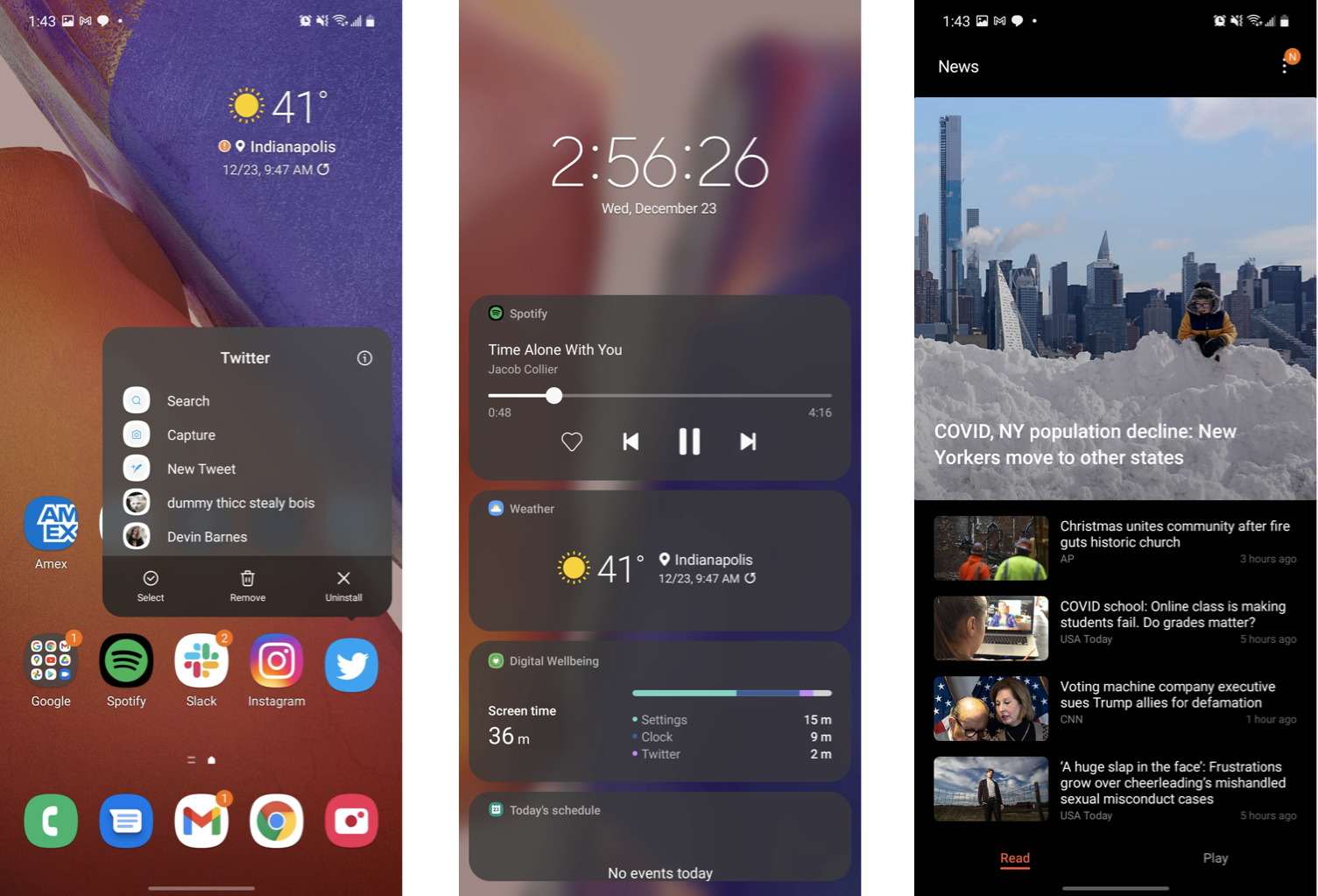
Back on the home screen, long-pressing on an app icon shows a similarly tidied menu compared to One UI 2.5, condensing actionable items into a single window instead of separating app-specific shortcuts from system-level actions like uninstalling the app. You can also now double-tap on any blank space on the home screen to turn off the screen without having to press the power button. Nice!
Interestingly, Samsung Daily (the news feed to the left of the home screen) has been replaced with a new service called Samsung Free, which similarly rounds up news from various sources, but also gives you access to instantly playable games handled through Samsung Game Launcher, without any additional downloads required. At least at the time of writing, these are mostly the kind of low-effort games you'd see advertised in other freemium titles, but it's a nice inclusion nonetheless.
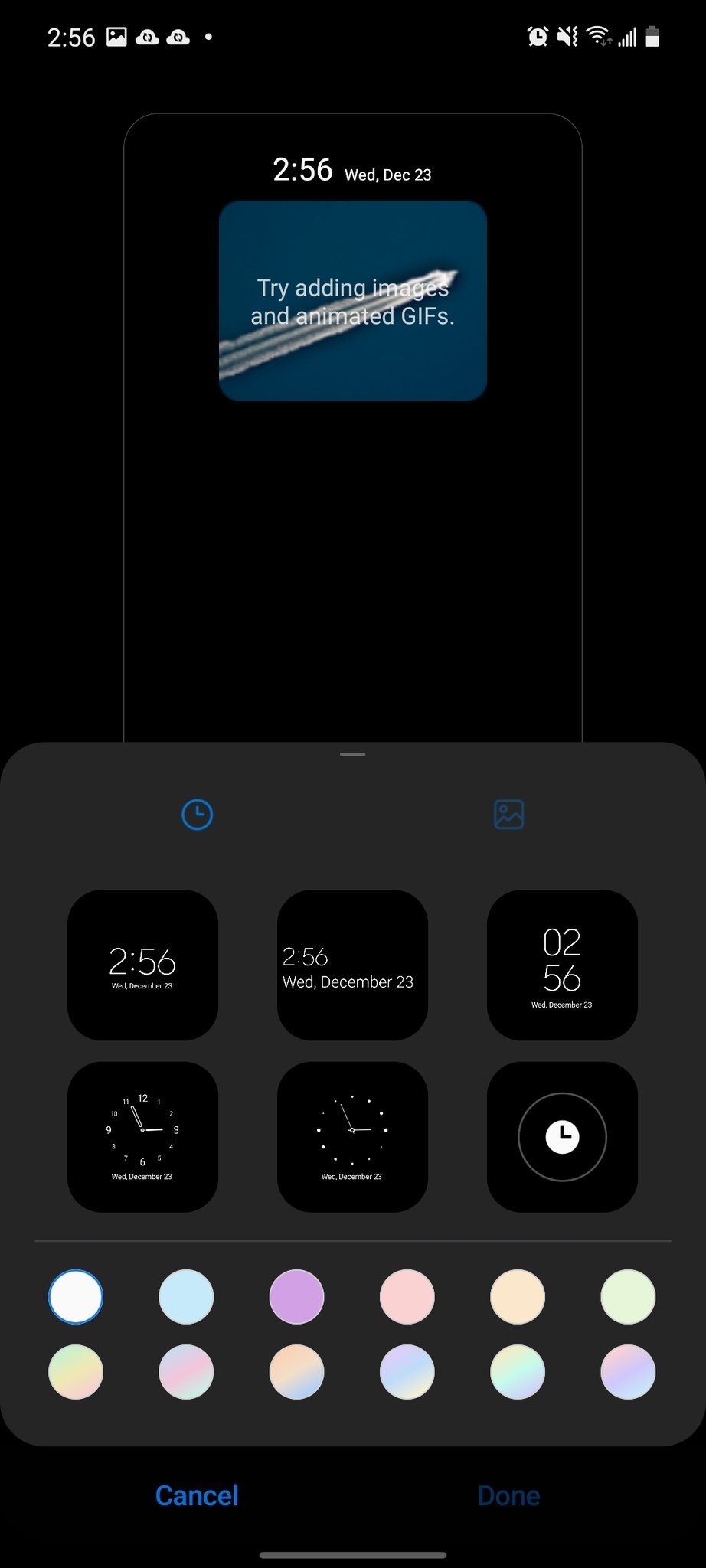
One UI 3.0 also brings minor improvements to the lock screen, with a new full-screen scrollable list of widgets giving you quick access to features like your music, schedule, weather, and Digital Wellbeing stats, all accessible by tapping the on-screen clock — which is now centered, rather than left-aligned. There are more comprehensive Always-On Display settings now, as well, including the ability to load your own GIFs.
Many of Samsung's first-party apps have been updated with slightly a modern design, including Phone, Samsung Pass, Gallery, and more. Most of these are fairly subtle, but it leads to a somewhat more cohesive overall look.
When I demoed the One UI 3.0 beta earlier this year, one of the more controversial changes in the eyes of Samsung fans was the redesigned volume menu, which opens as a minimalistic vertical slider when you press either of the volume buttons. By tapping the three dots at the top of the slider, you can open an expanded menu with sliders for system volume, alarms, media, and so on. I think this is a great look, but it's admittedly less straightforward than before, relying on icons rather than text labels to denote each slider.
Within that expanded view is also Live Caption, which transcribes dialogue audio in real time. This setting was available in Android 10 as well, but again, it's denoted by an icon rather than text here, for better or worse.
Camera improvements in One UI 3.0
The camera software in One UI 3.0 looks virtually identical to the implementation in One UI 2.5 on Android 10, but Samsung claims to have improved a few features under the hood relating to the image capture process. Namely, phones with high zoom levels like the Note 20 Ultra and S20 Ultra can now supposedly benefit from improved image stabilization while taking photos of the moon — an oddly specific feature that I wasn't able to test, since my S20 Ultra is still stuck on Android 10 and I sent back my Note 20 Ultra review unit months ago.
More broadly, both autofocus and auto exposure should see improvements with the One UI 3.0 update. This is, again, a change that would likely be most noticeable on the S20 Ultra, which remains the only phone in Samsung's 2020 lineup with which I've experienced focusing problems.
One UI 3.0 Bottom line
If you're expecting a complete overhaul rebuilt from the ground up, this isn't it. One UI 3.0 introduces minor aesthetic and functional tweaks to what was already a mature and capable interface in One UI 2.5. There really aren't many must-have feature additions here; part of that is because Samsung tends to offer many of its software features before Google introduces them to the baseline Android platform, so much of what's new in Android 11 was already present in Samsung's version of Android 10.
Still, this is a nice update that gives One UI some modern visual polish and largely improves notification management above all else — and more importantly, Android 11 brings Samsung's phones up to the same privacy and security standards as Google's Pixel line.
4.5 out of 5
Most variants of the Galaxy Note 20 and Galaxy S20 (with the exception of the Galaxy S20 FE) should be able to download the over-the-air Android 11 update by now, but if you don't have it yet, don't worry. Samsung is already ahead of its own roadmap for the One UI 3.0 rollout to various devices, so it's only a matter of time.
In the meantime, there's no need to sideload Android 11 to your Galaxy phone unless you just really want the latest software, but One UI 3.0 is yet another step in Samsung's journey towards a more refined and mature software platform.
Get More Galaxy S20
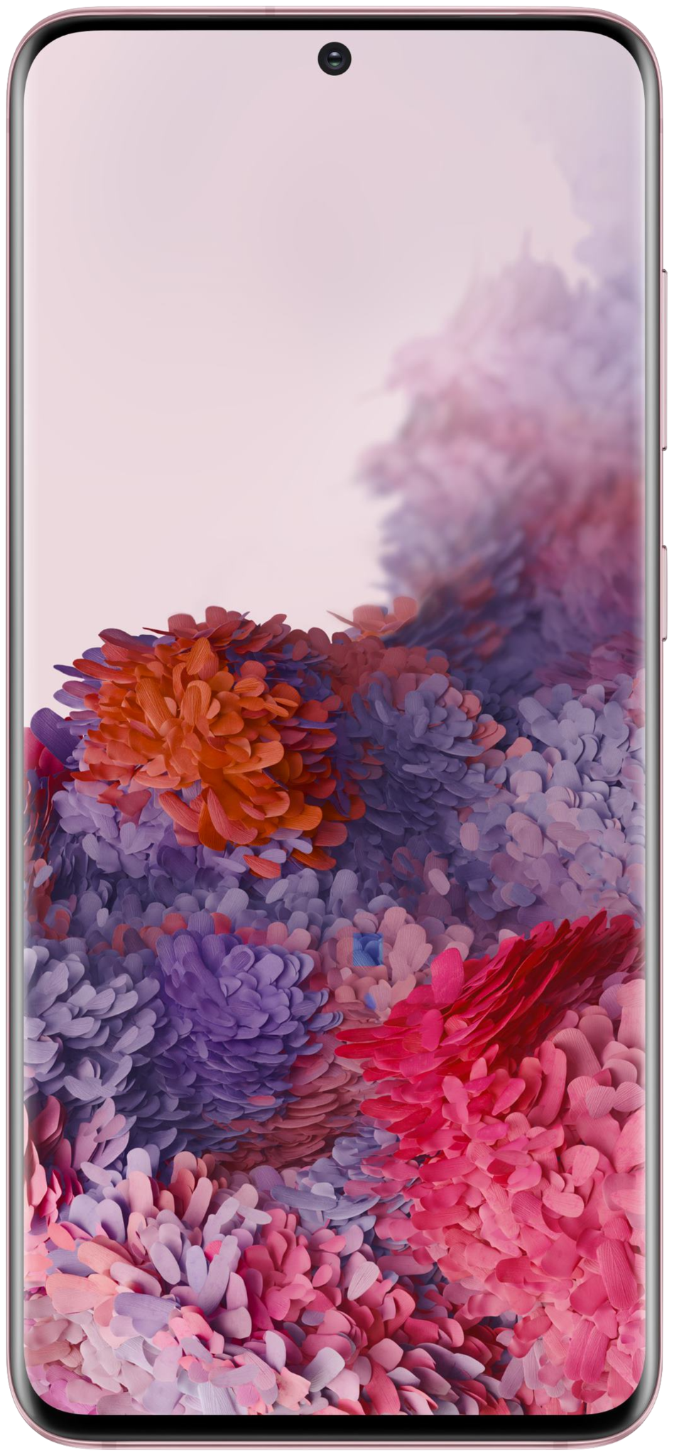
Samsung Galaxy S20, S20+ & S20 Ultra
by Hayato Huseman
- Get link
- X
- Other Apps
