- Get link
- X
- Other Apps
- Get link
- X
- Other Apps
It's not perfect, but this is a huge leap forward for Apple.
If you're reading this article, there's a good chance you've already heard about iOS 14 at this point. The next evolution of Apple's mobile operating system was announced at the WWDC opening keynote on June 22, and in addition to our friends at iMore covering the event extensively, we also had our own fair share of coverage here on AC.
Apple releases a new iOS update ever year, but this one is perhaps the biggest and most important we've ever seen. iOS 14 fundamentally changes how you interact with an iPhone, with many of the noteworthy changes being direct ripoffs of what we've had with Android since the very beginning.
After some initial hesitation, I went ahead and loaded my iPhone 11 Pro with the iOS 14 Developer Beta to see what it was like for myself, and after a few days of using the software, I think Apple may have created a better version of Android than we'll ever see from Google itself. Seriously.
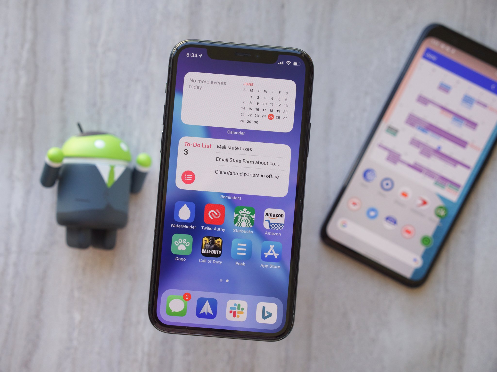
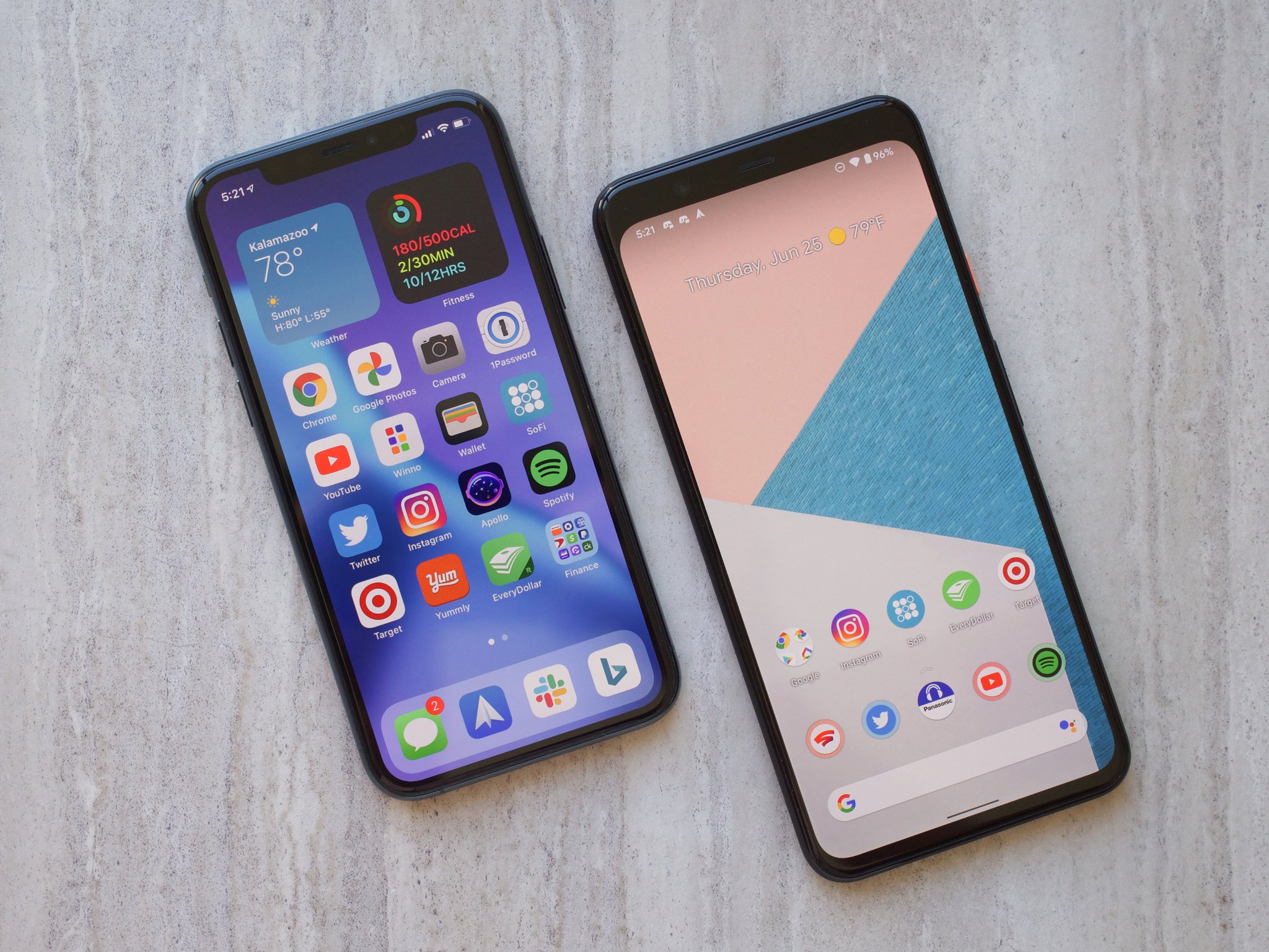
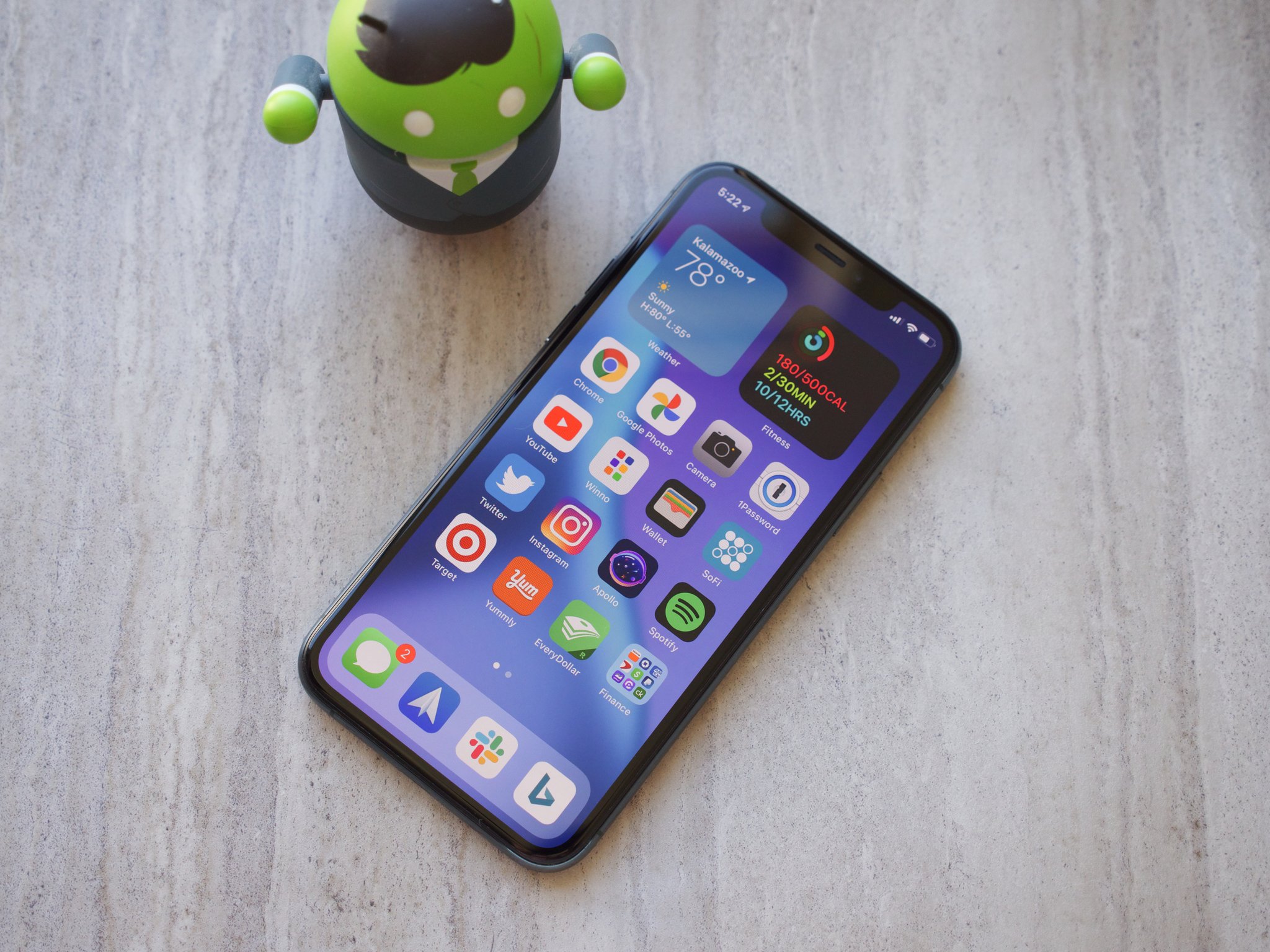
Let's start first with the most obvious change — the home screen. iOS's home screen has traditionally been nothing but pages of your installed apps, but with iOS 14, it now functions a lot like your Android phone. All of your endless app pages are still there by default, but you can go ahead and hide any pages you don't want to show up. From here, you're free to add and remove apps to your home screens as you see fit.
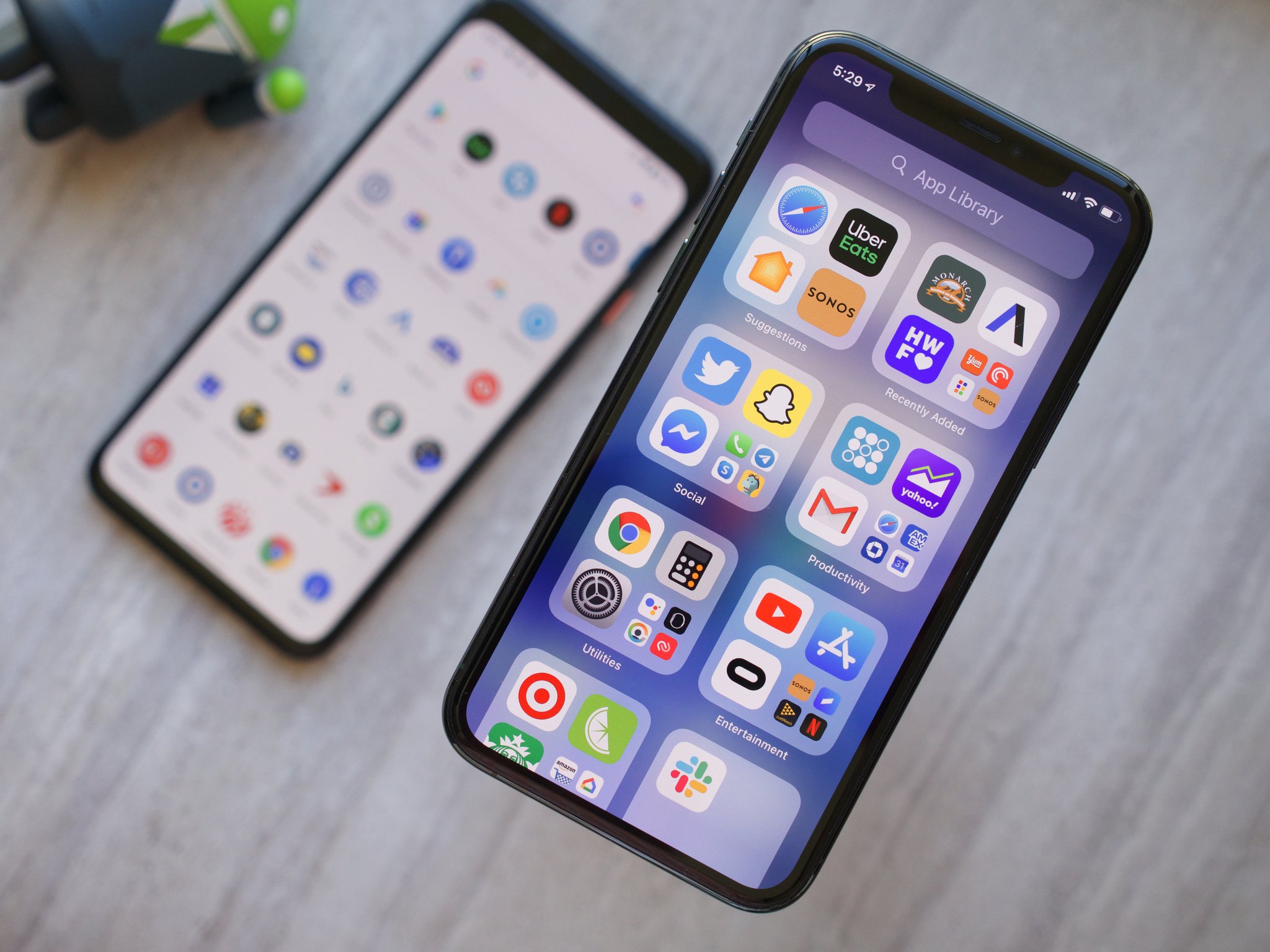
I have my 16 most-used apps on my first home screen, along with eight others that are slightly-less-used on my second page. All of my other apps (which there are a lot of) now live in the App Library, which is accessed with a swipe to the left on your right-most home screen. This is essentially Android's long-standing app drawer, but it functions a bit differently. Instead of having a scrolling list of your apps all laid out alphabetically, they're grouped into pre-made folders based on certain categories (such as Social, Productivity, Utilities, Entertainment, etc.). Tapping on the larger icons directly opens that app, while tapping on the smaller bundle of four expands that folder. Alternatively, you can swipe down or tap the search bar to see an alphabetical list of everything that's installed.
I know a lot of people aren't thrilled with how Apple implemented the App Library, but as a first try, it's actually pretty good. It feels organized, comes with gorgeous animations, and the Suggestions folder is already doing a decent job of predicting apps I may open next.
The App Library could use some tweaking, but it's a massive step in the right direction.
I'd love to see Apple allow users to customize these folders, or better yet, have the option to just view an alphabetical list by default. Even so, just having any sort of app drawer in iOS is a complete re-thinking of the software and makes my iPhone feel less cluttered than it ever has. Just like on my Pixel 4, I now have a couple of home screens for the apps I use all the time, while everything else is tucked away and out of sight until I need it.
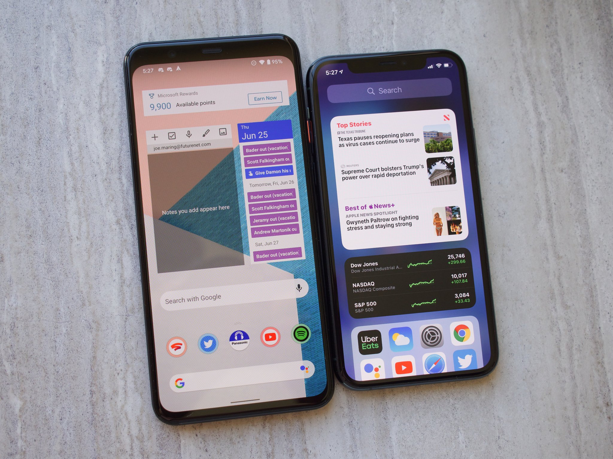
The second component of the home screen overhaul comes in the form of widgets. Widgets have existed in iOS for a while, but they've been reserved to the left-most page next to your home screens. You can now place widgets on your actual home screen for much easier access — again, just like Android. However, while the App Library is mostly an alternative to Android's app drawer, iOS 14's widgets are a marked improvement.
There are a few reasons for this, the first of which is the design. Widgets in iOS 14 have a cohesive design language and look like they all belong with one another. This is not the case with Android, in which every widget has its own distinct appearance/style. At least to my eyes, this means that iOS 14 widgets look like thoughtful expansions of my home screen rather than something that's just tacked on.
Widgets in iOS 14 are more functional, too. Apple got a lot of buzz for its Smart Stack widget, which automatically cycles through different widgets throughout the day based on what iOS thinks you'll find more useful at any given time. Even cooler, you can make your own widget stacks by dragging one widget on top of another — giving you the option to manually scroll through them or have them do the same automatic switching.
You can make fun of it taking Apple this many years to finally add such a basic feature to iOS, but the implementation here is just so much better in virtually every way.
The tweaks to the home screen are the most notable differences with iOS 14, but there are other things it borrows from Android that further enhance the user experience.
Picture-in-picture, for example, can be re-sized just by pinching and zooming on the miniature video player and has playback controls for rewinding and fast-forwarding by 15 seconds. There's also a feature that allows you to hide the video off-screen to just hear audio, and whenever you want, bring the PiP player back out onto your screen. It took Apple a long time to adopt the feature, but it's more functional and well-thought-out than Android.
For just about every feature Apple "copied," it improved on Google's implementation in one way or another.
Swipe down to access the Control Center, and you'll find Apple Home shortcuts right there with all of your other controls (not hidden away in a power button shortcut the way Google has it implemented in Android 11). You can also (finally) set default apps for your web browser and email, which slowly tears down just a small part of Apple's infamous walled garden.
All of that means that my iPhone now looks and feels a lot more like my Pixel, all while retaining everything that has always made iOS so damn great. It still has iMessage, AirDrop, higher-quality apps, unmatched performance, and is backed by years of software updates on a level that no other company can compete with.
There are certain aspects of iOS 14 that aren't perfect, such as there still being some restrictions on where you can place apps and widgets on your home screens, but it's kind of insane how much it already feels like a more polished version of Android. iOS 15, 16, and beyond are bound to iron out some of the kinks and further expand on the ideas introduced with this latest update, and I cannot wait to see how they turn out.
Does all of this mean Android is suddenly irrelevant and has no reason to exist? Of course not. There are certain things Android still does better, namely managing notifications, app permission handling, and offering users more expansive customization options (being able to place apps and widgets anywhere on the home screen, third-party icon packs, launchers, etc.). But iOS 14 makes the iPhone a lot more accessible to Android fans that have typically been put off by its overly restrictive nature.
For the very first time, my iPhone feels personal and unique in almost the same way my Pixel does. The combination of those core Android staples and the various benefits iOS has had for ages makes iOS 14 a seriously excellent bit of software, and by my account, it's already enough to replace Android.
Give it a couple of years and some updates to improve on this formula, and it won't even be a competition.
- Get link
- X
- Other Apps
